One of many ways to create a design system (Part 3)
This is part 3 in a blog series about our approach to creating a shared design system for myHAZ-VCT PLATFORM.
- Part 1 - What are design systems?
- Part 2 - Tools for creating sharing and managing design systems
- Part 3 - One of many ways to create a design system
- Part 4 - Does every project need a design system?
Many ways to create a design system
Once we had a good understanding of user goals, the common tasks they perform and pain points that might arise in their journey, we created a rough prototype to visualize the various task flows for all three applications.
After a few iterations and user testing we were pretty certain how the three platforms were going to work. So it was time to start building.
Some design systems are created in advance of product development, some - only after the product is released and a need to make it more consistent arises. In our case, it was built simultaneously with the three apps it was supposed to support.
Design principles
Design system doesn’t have to be considered only after the research stage. Broader design principles can be set early in the design process. This is one the principles we defined:
“The purpose of myHaz is to help people collect, analyze and respond to natural hazards related information. That’s why usability, performance and accessibility should be prioritized over experimental design. This way it can be used by as many people as possible with wide range of skills and in a wide range of contexts.”
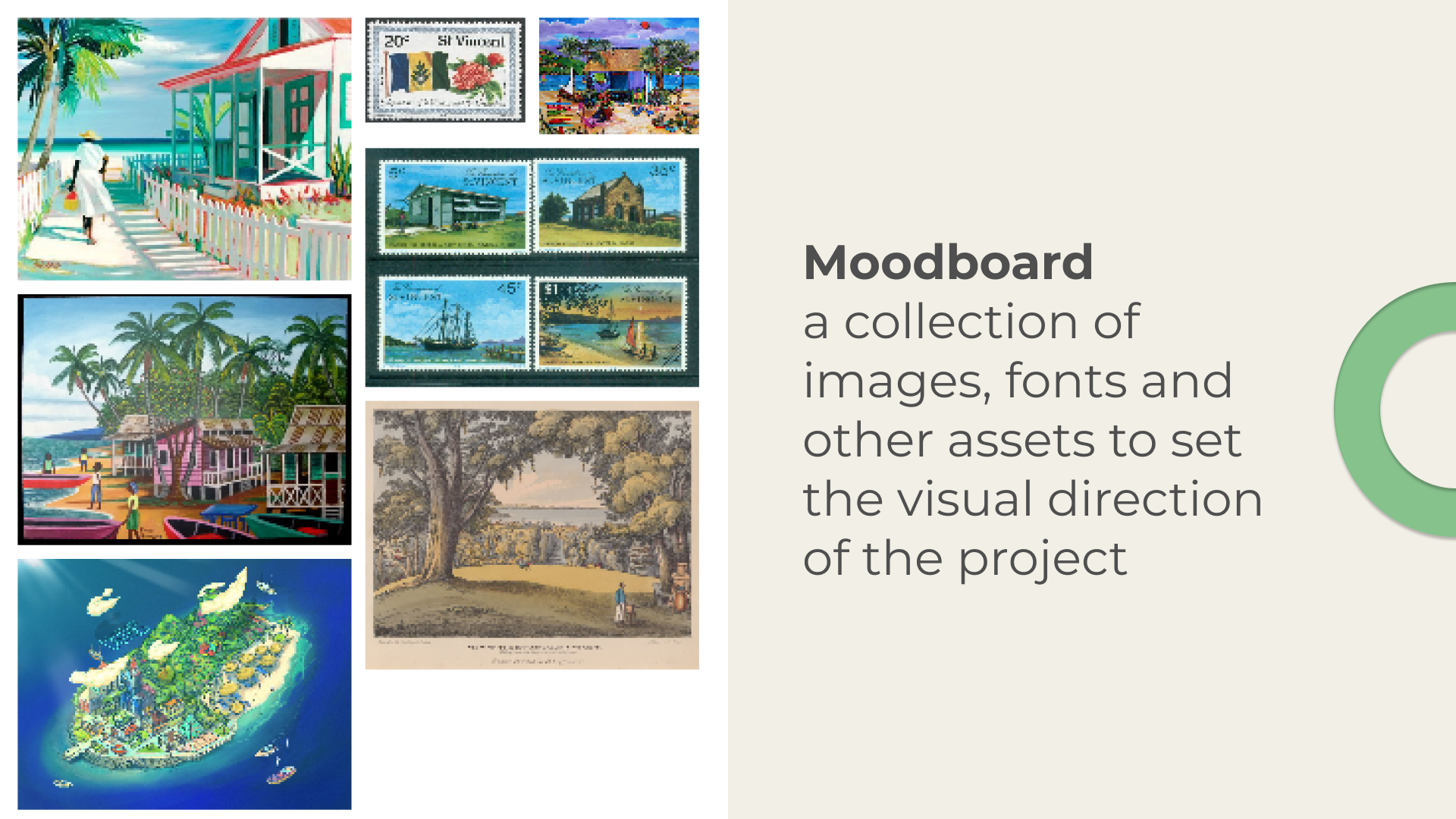
Moodboard
Moodboards help you define the look and feel of the product you’re creating.
We wanted the tone to match the purpose of the app - to help people report hazards, to be notified of danger and to monitor the data being collected. Since the app would be used by people living in Saint Vincent and the Grenadines (island country in the eastern Caribbean Sea), we also wanted it to feel like it belongs there.
 myHaz moodboard
We created a moodboard using pictures, paintings, architecture and other assets from people in that region. This helped us get a better feel for the place where this platform would be used and the people who would use it.
We settled on a pallet was that was filled with warm and light tones. But we also added some bright red to resemble the danger that the app is supposed to help notice, report and analyze.
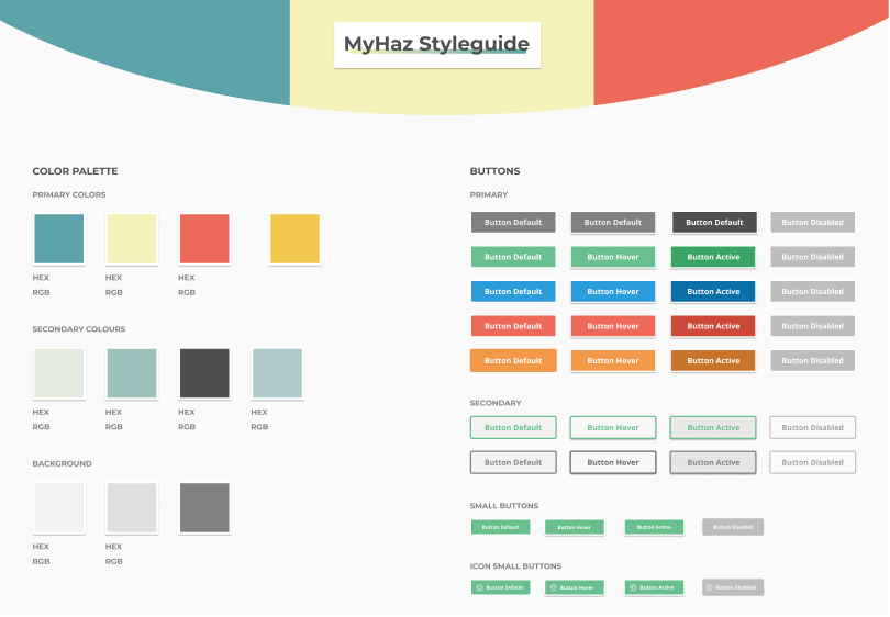 myHaz styleguide in Figma
UI Inventory
First thing we did was create a UI inventory of the elements required for the three different applications. Most design systems have a lot in common - they need buttons, check-boxes, toggles, form elements, tables, etc.
One thing we learned is that it’s better to keep the components modular - that way they can be used in more contexts than one. For example, instead of creating a very specific card component (a container that groups related pieces of information) with other components nested within it, it’s better to break up larger components into smaller ones. Then, those smaller components can be used in more contexts. However, we haven’t always stuck to this principle and some components were created just for a single use case.
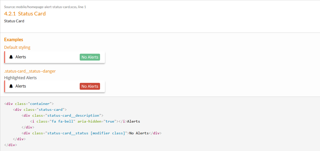 This component could be split up into smaller components - the card component with a left border, text with an icon and a badge. It would make it more modular and more usable in other contexts.
This is what Brad Frost calls ‘Atomic Design’. Start with the smallest bits - the atoms (typography, colors), combine them into bigger bits - the molecules (cards, list elements), then, collections of molecules can become - organisms (collections of cards, lists, etc.) and so on. Maybe it’s not the most biologically accurate metaphor, but the principle is similar - order on the smaller scale, creates order on the larger scale.
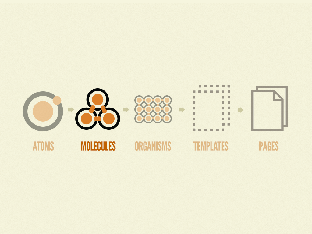 Atomic design principles by http://atomicdesign.bradfrost.com
Design system integration into multiple projects
The main purpose of this styleguide was to provide a single stylesheet and the building blocks for three different applications. If people switched from using the app, to using the web portal - it should feel like it’s part of the same experience.
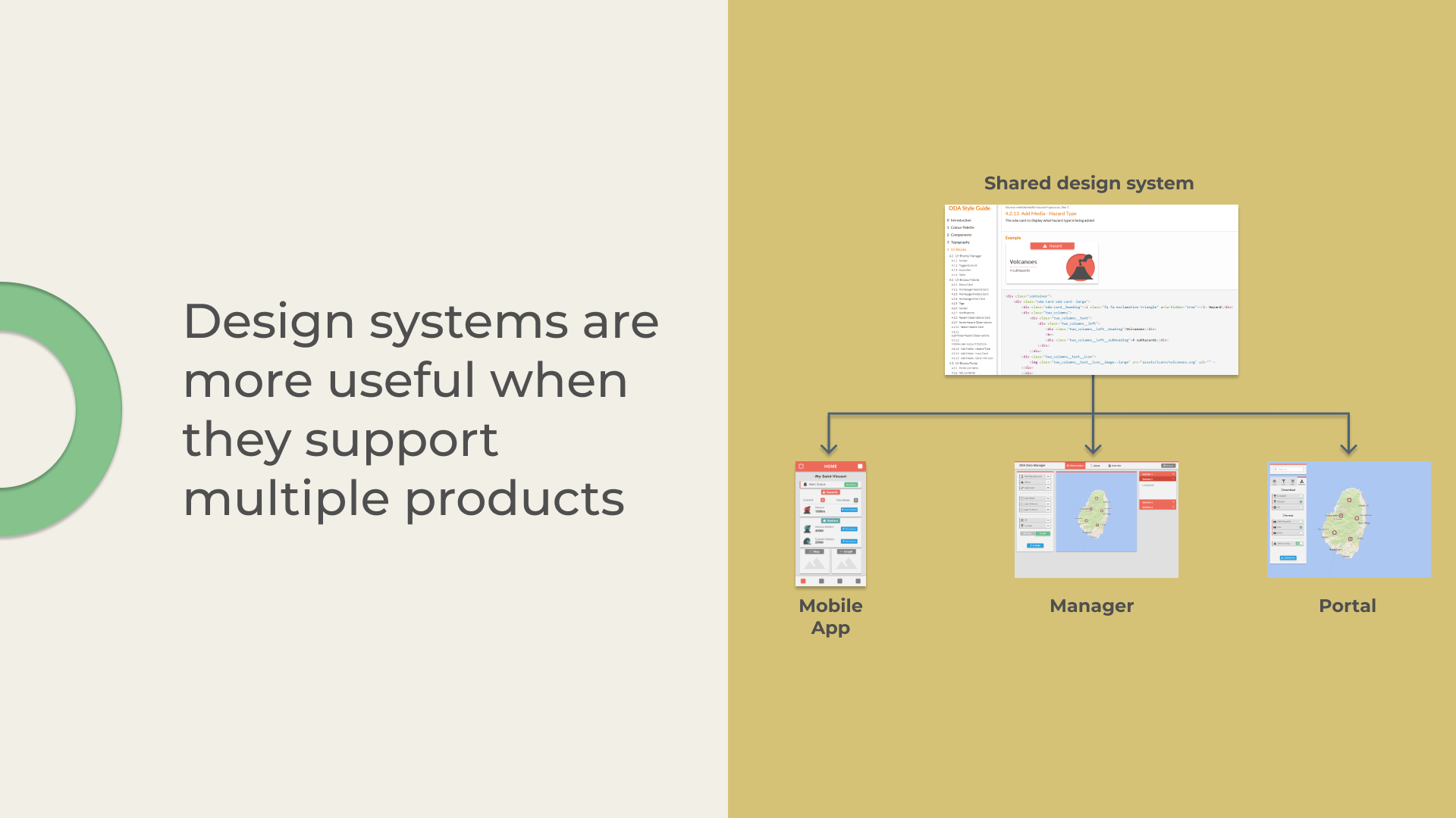 Design systems are more useful when they support multiple products
Two of the apps shared a similar tech stack: portal and manager were built using Angular - so it was slightly easier to integrate it. But the mobile app was built using a slightly different technology - Ionic (it relies on Angular as well, but has its own quirks). Ionic has its own design library and its own way to create new themes for its apps, so incorporating the styleguide from KSS wasn’t as straightforward.
But in general, all three applications work with SCSS files. So, we set up an automated process on GitLab to fetch the relevant files from the design system repository and load them into the appropriate locations on other projects. This process wasn’t 100% automated (mobile stylesheets were slimmed down manually to remove unnecessary styles for mobile platform), but it made things slightly simpler.
Workflow
Once we had the workflow setup the creation of new components looked something like this:
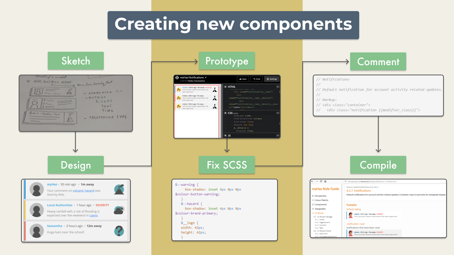 The process for creating new components
Step 1: Sketch out the elements or use the existing ones from the prototype in Balsamiq.
Step 2: Recreate them in higher fidelity in Figma.
Step 3: Prototype them in codepen (it’s a good place to experiment with small bits of code when you want to see the changes instantly)
Step 4: Refactor the scss code to be more readable (we used BEM model for writing scss code - it makes it easier to see how different parts of a component are related to each other).
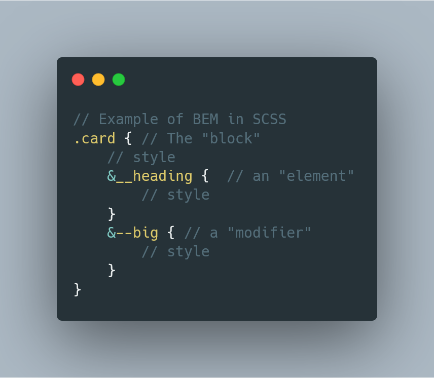 An example of scss code structured using BEM methodology
Step 5: Write the comments for the component which would be used to generate the related documentation on the static website
Step 6: Project would listen to file changes and recompile. It was stored on gitlab, and we used gitlab pages to make it accessible to everyone without the need to run it locally. Other projects would fetch the necessary stylesheets from there as well.
comments